I recently embarked on a trip to The Design Museum. I have had a secret love of motorway signs for some years now - having admired their sheer scale when dashing past them at 70mph. So to get up and close to one was pretty cool!
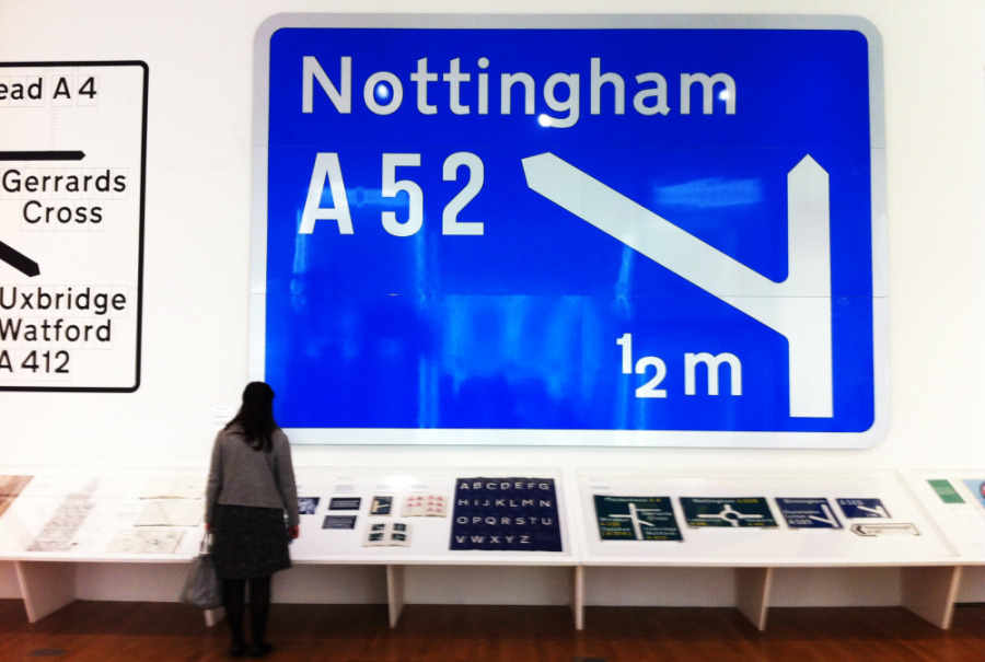
The motorway sign system was designed by Kinneir Calvert in the 1960s, with a need to be legible from 180m away - hence their size. The M1 Motorway signs was a test case for the designers, which, after its success, meant that they went on to design and unify the entire road sign system - which we still use today. The font, Transport, was specially designed for this usage.
I think the thing I love about it is the scale. BIG typography. (I'll blog about car park signage another time!) All of this proves that the best signage in the world is both simple and clear.
David